This article explores mobile SEO best practices with a specific focus on two vital aspects: Core Web Vitals and load speed.
In today's digital age, mobile devices have become our constant companions, serving as gateways to the vast online world.
As a result, mobile search engine optimisation (SEO) has evolved into a critical aspect of a successful online presence.
Ensuring that your website is not only accessible but also performs optimally on mobile devices is essential for attracting and retaining users.
Core Web Vitals and load speed play a pivotal role in determining your website's performance on mobile devices.
Let's delve into the world of mobile SEO to understand how you can enhance your website's mobile experience.
Understanding Core Web Vitals
Before diving into the nitty-gritty of mobile SEO, it's essential to comprehend the significance of Core Web Vitals.
These are a set of metrics defined by Google that are used to assess the overall user experience and performance of a website.
The three main Core Web Vitals metrics are:
1. Largest contentful paint (LCP)
LCP measures how quickly the largest content element on a page loads. To ensure a good LCP score for mobile SEO:
- Optimise images: Large image files can slow down your website's loading speed. Ensure that images and other assets are not unnecessarily large in file size, that their dimensions are relative to the size of the screen they are going to be displayed on, and that they are using an efficient format such as WebP.
- Lazy loading: Enable lazy loading for content below the fold. This means that images and other elements are loaded only when they come into the user's view, reducing initial load times.
- Minimise unnecessary code: Reducing unnecessary code and JavaScript can help improve LCP. However, be cautious not to disregard important features, even if flagged as "unnecessary."
- Divide CSS: Divide your website's CSS into critical and non-critical styles. Load critical CSS first to ensure a faster initial rendering of the page.
- Eliminate render-blocking scripts: These scripts can block the first paint of your page. Consider delivering critical JavaScript and CSS inline and deferring non-critical scripts and styles. Some scripts may have other benefits to the user experience or your ability to report on your site’s performance. Consider delaying these rather than removing them entirely.
- Visible text during web font load: Leverage the font-display CSS feature to ensure that text remains visible to users while web fonts are loading.
LCP is a crucial metric for mobile SEO, as it directly impacts user perception of your website's loading speed.
2. First input delay (FID)
FID measures how long it takes for a web page to respond to a user's first interaction, such as clicking a link or button. To improve FID for mobile SEO:
- Compress JavaScript and CSS: Smaller file sizes can lead to faster loading and better FID scores.
- Break up large JavaScript tasks: Divide large JavaScript tasks into smaller ones to reduce the impact on FID.
- Load necessary code first: Prioritise loading necessary code before larger blocks of code.
- Reduce third-party code impact: Limit the impact of third-party code and scripts on FID by optimising their placement and activation.
- Consider CAPTCHA impact: Be mindful of how CAPTCHA affects form interactions on your mobile site.
FID is especially important for mobile users who expect quick and responsive interactions on their devices.
NB: Currently scheduled for March 2024, First Input Delay will be replaced by another metric: Interaction to Next Paint. At this early stage, we believe the majority of recommendations above will be similar and still relevant, this is just the way performance is measured that is changing.
3. Cumulative layout shift (CLS)
CLS evaluates the visual stability of a webpage by measuring how much content shifts as the page loads. To tackle CLS issues:
- Review cookie banner placement: Consider the placement of elements like cookie banners and adjust them to reduce layout shifts by delaying when they load and/or having them load at the bottom of the page.
- Avoid promotional pop-up banners: Pop-up banners, especially on mobile, can lead to undesirable layout shifts. Consider alternatives or minimise their impact.
- Optimise images: Ensure image file sizes are small, and their dimensions are correct to prevent layout shifts.
- Set image dimensions: Set width and height attributes for images to ensure frames load first, maintaining stability. Use percentages to maintain responsiveness.
- Inline above-the-fold fonts: To reduce slow loading, consider inlining above-the-fold fonts while allowing the rest of the page to load fonts asynchronously.
These Core Web Vitals metrics provide a holistic view of your website's user experience, particularly on mobile devices.
Optimising these metrics will not only improve your mobile SEO but also enhance the overall usability of your site on smartphones and tablets.

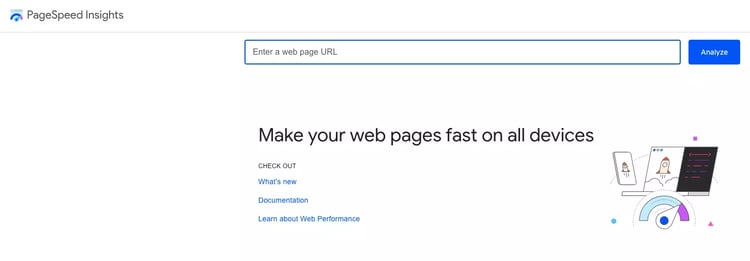
Want to test your website? You can do so using Google’s PageSpeed Insights Tool.
The significance of load speed on mobile
Mobile load speed holds a pivotal role in the world of mobile SEO and for good reasons. The need for speedy loading times on mobile devices is not solely a matter of user convenience; it's rooted in several critical factors that influence the mobile browsing experience.
1. Slower connections
One of the most apparent reasons for emphasising load speed on mobile devices is the variability in internet connections.
Unlike desktop users who might enjoy high-speed broadband connections, mobile users often contend with diverse connectivity situations. From 4G and 5G networks to public Wi-Fi and even 3G in some areas, the speed of mobile connections can fluctuate significantly.
In regions with less developed infrastructure or rural areas, mobile networks may provide slower download speeds due to limited coverage or network congestion. This can result in frustratingly slow load times for websites with heavy content or inefficient code.
2. Limited data plans
Another crucial consideration is the cost of data for mobile users. Not everyone has access to unlimited data plans, especially in segments of the population where financial constraints are a significant concern.
This includes vulnerable individuals, those living in poverty, or charitable organisations that cater to such demographics.
For these users, every megabyte of data counts. A data-hungry website that consumes excessive data to load could deter potential visitors who wish to conserve their limited data allowances for essential tasks.
In these situations, it may be more appropriate to design your site with a focus on delivering a “light” website that loads quickly, rather than one with flashy designs or complex functionalities.
3. Accessibility and inclusivity
Load speed isn't just a matter of convenience; it's also about accessibility and inclusivity.
Slow-loading websites can pose significant barriers for individuals who may have disabilities or use assistive technologies to browse the web.
Ensuring that your website loads swiftly and efficiently on mobile devices ensures that it's accessible to a broader audience, promoting inclusivity and equitable access to information.
4. User experience and bounce rates
User experience is at the core of mobile SEO, and load speed plays a pivotal role in shaping that experience. Studies have consistently shown that users have little patience for slow-loading websites on mobile devices.
Slow load times can lead to higher bounce rates, where users abandon a site before it fully loads. High bounce rates can negatively impact your website's search engine rankings and overall user engagement.
Prioritising load speed on mobile devices is not merely a matter of website optimisation; it's a recognition of the diverse and often challenging mobile browsing environments that users encounter.
Whether it's due to slower connections, limited data plans, or the imperative of accessibility, delivering a fast and efficient mobile experience is essential for ensuring your website's success in the ever-evolving digital landscape.
Quick wins for mobile SEO optimisation
Apart from addressing Core Web Vitals, there are several "quick wins" that can significantly boost your mobile SEO performance.
These quick wins involve optimising your website for better load speed and user experience:
- Image optimisation: Large image files can slow down your site. Consider compressing and resizing images to reduce their file size without compromising quality. For a comprehensive guide on image optimisation, you can refer to our image optimisation guide.
- Avoid auto-playing videos: Auto-playing videos, especially those with high-resolution or long loading times, can negatively impact mobile load speed. Allow users to choose when to play videos.
These quick wins are essential for improving the initial loading speed of your website on mobile devices, contributing to a better user experience.
However, after implementing these changes, you might find that further optimisations require the expertise of your development team.
Collaboration with developers
Effective collaboration between your SEO team and developers is pivotal for implementing advanced mobile SEO improvements.
While quick wins can be achieved with simple configurations, more significant enhancements often require developer intervention. Here are strategies to foster collaboration:
- Alignment of objectives: Ensure that your SEO goals align with the broader objectives of the development team. When everyone shares a common vision, it's easier to prioritise improvements that benefit both mobile SEO and website development.
- Clear communication: Maintain open and transparent communication channels with your development team. Clearly articulate the SEO requirements and how they align with the website's overall performance and user experience.
- Education and training: Provide your development team with resources and training related to mobile SEO best practices. Equip them with the knowledge they need to implement changes effectively.
- Regular meetings: Schedule regular meetings or check-ins to discuss ongoing projects and address any SEO-related concerns or questions your developers may have.
- Feedback loop: Establish a feedback loop for ongoing collaboration. Gather feedback from the development team regarding the feasibility and impact of proposed SEO changes.
- Prioritisation: Collaboratively prioritise mobile SEO improvements based on their potential impact on user experience and SEO rankings.
- Testing and QA: Work closely with developers to conduct testing and quality assurance (QA) checks to ensure that mobile SEO enhancements are implemented correctly.
By nurturing a collaborative relationship with your development team, you can effectively implement mobile SEO best practices and drive positive changes that enhance your website's mobile performance.
Core Web Vitals and the bigger picture
While achieving a 100% score on Core Web Vitals is a commendable goal, it's essential to understand that it's not always the ultimate benchmark for success.
Sometimes, essential website features that improve the overall customer experience, such as live chat functionality, may have a slight negative impact on Core Web Vitals scores. This doesn't mean you're failing in your mobile SEO efforts.
Core Web Vitals should be viewed as valuable tools for flagging areas of improvement rather than strict performance metrics. It's crucial to strike a balance between optimising for Core Web Vitals and delivering essential features that enhance user engagement and satisfaction.
In conclusion, mobile SEO is no longer a nice-to-have; it's a must-have for businesses looking to thrive in the digital landscape.
Core Web Vitals and load speed are integral components of mobile SEO, impacting user experience and search engine rankings.
By addressing these aspects and fostering collaboration with your development team, you can ensure that your website provides a seamless and optimised experience to mobile users.
Remember that Huble offers SEO consultancy services, and our team is here to help you implement these mobile SEO best practices on your website.
If you're ready to elevate your mobile SEO game, don't hesitate to contact us to learn more about how we can assist you.


.png)


