

LinkedIn Ads benchmarks for 2023
If you're wondering how to create a good landing page in HubSpot, we have put together a list of 9 best practices to create a landing page that converts!
A landing page is a web page specifically designed to convert visitors into leads or customers.
This can be achieved by getting visitors to take action. Some of these actions could include filling out a form, subscribing to a service, downloading an ebook, or making a purchase. Landing pages are created to support marketing or advertising campaigns.
Landing pages can be used for a variety of purposes, such as promoting products and services, building credibility, and increasing engagement. They are standalone pages that are not part of a website's navigation. Their goal is to drive targeted traffic to a single page that is optimised for conversions.
Because of single focus, it is common for Landing Pages to be very basic, and almost an afterthought in marketing or advertising campaign planning. But considering this is the final hurdle a user has to face before they become a lead, surely it makes sense to ensure your Landing Pages are performing as best they can.
This blog explores ten landing page best practices you should consider when planning your next HubSpot marketing campaign.
Before we start though, one thing to remember is that landing pages are often tied to ads and short-term campaigns, but the landing page does not have to be deleted once the campaign is over. If possible, think about how the offer can be made evergreen, and landing pages can be updated and optimised to live on. That way they can continue to attract traffic from search engines and convert even after the campaign has passed. And over time your site has more ways of attracting an converting leads.
Think of it this way: Netflix runs a campaign for a month, enticing people to purchase a subscription with a discount. But at the end of the campaign, they do not need to remove this landing page, just the discount offer. That way, when someone searches “netflix subscription” on a search engine they can find this landing page specifically optimised for that keyword and use it as a quick conversion point.
Ensure that the first place your visitors come into contact with your website matches your landing page. It is also important that you’re sending people to a page that matches your message, to meet the visitor’s expectations.
For example, if you are advertising “Free Services” and your landing page messaging conveys that services need to be paid for, visitors may not be happy about this false advertising.
Another example is if you are communicating lighting for large industrial buildings, and your landing page is for household light bulbs, visitors are likely to click off your landing page.
Visitors may deem your website untrustworthy, and you will only lose out on conversions.
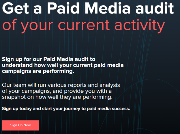
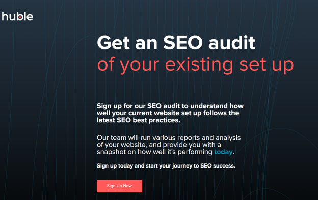
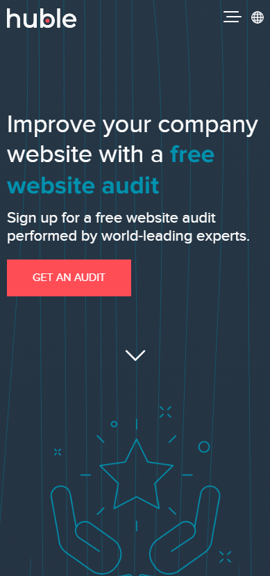
This page’s title is “Free Paid Media Audit | Huble Digital”. The content of the landing page needs to match the title of the page.
.png?width=608&height=166&name=image%20(5).png)
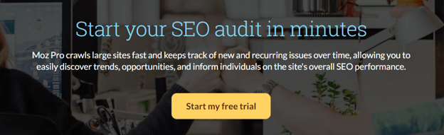
Example 2:
This is another example of consistent messaging, where Moz advertises a trial for 30 days, and once you’ve clicked on the link their landing page is consistent with the messaging.
Ensure that your landing pages match the design and tone of your website.
Once the visitors choose to visit your site, it should be clear that your site and landing page are from the same brand, and it should feel familiar to the visitor when they decide to visit your site.
This is a good way to build trust and familiarity, increasing the likelihood of visitors converting.
Here you can see that this landing page, by Huble, matches the website’s font, colour scheme and tone.
In this example from Semrush, we can see that the colours do not remain exactly the same, but the “Look and Feel” remains fun and light, using bright colours and a consistent orange button, that is the same colour as their logo.
Keep the action users need to take above the fold, which means keeping CTA’s, on the part of the screen you see before needing to scroll down.
This is where you want to meet visitors and get them to take action without distracting them with other text or images and where you want to communicate all your important information first. Additional information can be added below the fold if necessary.
Keep your landing page simple and focused, don’t provide too much content for visitors to read. 
This is another good example by Netflix, of keeping the action above the fold, limiting distractions and having a clear message and CTA.

Landing pages should be simple, & the main goal of the page should be obvious: click to convert.
The design should also be clear and not be cluttered with unnecessary information such as text graphics, which can distract the visitor from taking action.
In this example promoting Huble's free SEO Audit, we can see that there is not too much information on the landing page before the CTA, although this landing page could get away with less content above the fold.
We will explore a more minimalistic landing page layout in example 2.
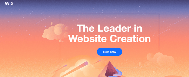
The WIX brand uses very minimalistic landing pages, and the user does not need any more information on this page to know what will come after they click the “Start Now” button. Not all websites can get away with this.
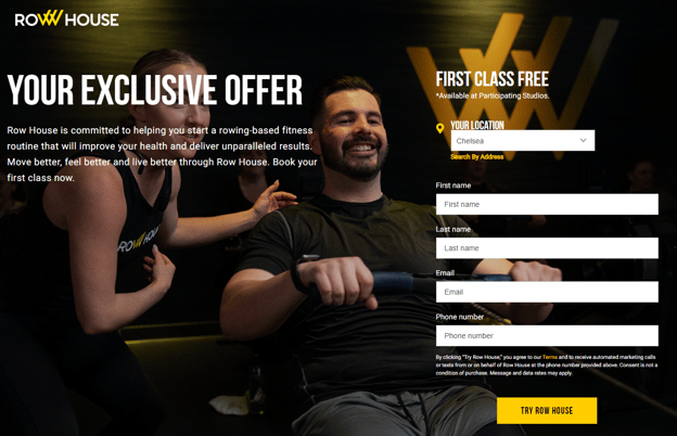
In this example from Row House, more information is required to entice visitors to fill in their information and join Row House.
Using a strong headline is the first thing visitors will see on the page, the headline should outline the main benefit, and it should be clear, and grab the visitor’s attention.
Include persuasive content on the page which is persuasive, and highlight the benefits of the product or service. Swiftly address any objections a visitor may have in the headline.
This is a clear and eye-catching heading, but could also be seen as being too wordy.
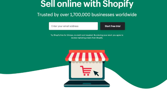
This is a clear headline by Shopify, that is short and to the point.
Using visual elements such as images and videos can help to engage visitors and make the page more appealing, but be careful not to draw too much attention away from the call to action.
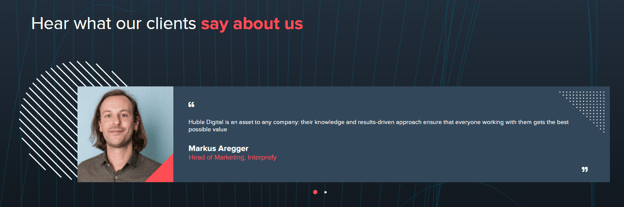
If your company will benefit from it, and it is relevant to your business, including customer testimonials, trust badges, or certifications can help to build trust and increase conversions.
Here is a testimonial by one of Huble’s happy customers.
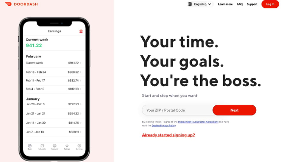
This landing page by Doordash is another example of visual elements that can add to a landing page and not distract from the message, bringing a visual to what the app looks like is something that can help convince visitors to click on the link.
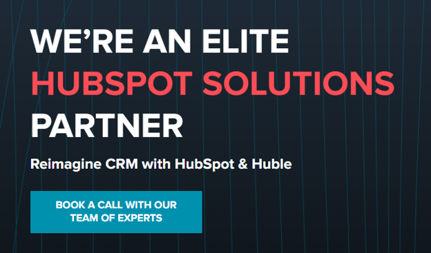
Make use of CTAs on landing pages to drive conversions: Use clear call-to-action buttons that are easy to find (above the fold). These are important because they guide the user towards the next action you want them to take on your website and helps move them closer to a desired conversion or goal.
The CTA on this landing page is promoting Huble as an Elite HubSpot Solutions Partner. It stands out by making use of a different colour to the background and the primary colours of Huble's brand (red and white). This blue CTA clearly indicates what we want the visitor to do, and what will happen when the visitor clicks the CTA: being connected with a Huble team member.
In this example by AirBNB, we can see that they use their branding colours for the CTA. They have also strategically darkened the side of the picture where the text and CTA appear, to make it stand out more.

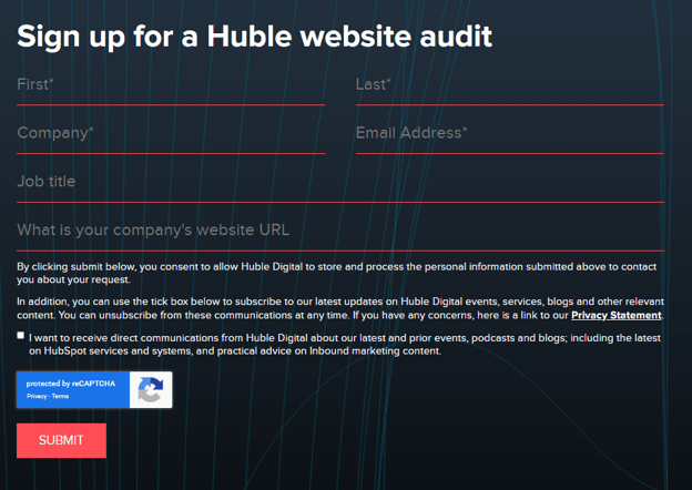
Make sure the form fields are minimal and straightforward to fill out, this will deter visitors from feeling that you are asking for too much information too fast, or that the form will take too long to fill out, causing them to leave.
You should be asking for an appropriate amount of information from the user that is relative to the exclusivity of what they will receive in return.
So, for a basic eBook or webinar recording, name, company name and email address is a reasonable request. But for a more extensive piece of research, you should be able to ask additional information such as size of company, or if signing up to a free in-person event you may want info such as dietary requirements.
This is where HubSpot's Progressive Form Fields can help. You ask for basic information on their first form fill, but when repeat visitors convert again, you can use smart form fields to ask additional questions and improve your profile on that contact.
Huble keeps its forms short and sweet, which may not be a luxury other sites can afford, but ensuring that only relevant information is requested will not scare visitors away.
Mobile optimisation is something every website owner needs to be thinking of when creating any web page. But with landing pages, especially those being promoted by paid channels, you're trying to drive the user to act, and so want to make that process as smooth as possible.
Make sure all landing pages are optimised for mobile devices, text is visible, buttons are large enough to click and the page loads quickly. Anything that could frustrate the user, risks them bouncing or not converting.
How long you are planning to have the landing pages running can determine whether they need to be monitored and optimised over time.
Make small tweaks to landing pages to ensure that they are up to date or optimised for specific target audiences in order to improve conversions.
HubSpot's built-in A/B testing features can also be used here to run conversion optimisation programmes to further improve these pages' ability to convert. Create two variants of a page, split your traffic equally between them, run the experiment until you have enough data, then analyse and implement the winner. Rinse and repeat.
If Conversion Rate Optimisation is something you need help with on your own site, get in touch.
When building and managing a marketing campaign, with all of the other priorities and considerations, it may be tempting to just create a landing page as quickly as possible, set it and forget it.
But taking the extra time to follow the landing page best practices discussed here can increase the likelihood of visitors converting into leads, and drive the ROI of your campaigns. A well-optimised landing page can also help improve SEO by targeting keywords your other site pages are not.
Marketers that follow these best practices can take their landing pages to the next level and maximise their success. risk missing out on those additional conversions
If you need any assistance in creating landing pages, you can reach out to our team here.
.png)
Your website is your most valuable sales and marketing tool, so it needs to be as optimised as it can be. Uncover opportunities to boost your rankings with a free SEO audit.